Cotton Council International
Year
2017
Team
- Christina Calvit (CD)
- Dmytri Gouba (Design)
- Won J. You (UX)
My Role
- UX Direction
- Interaction Design
- Strategy
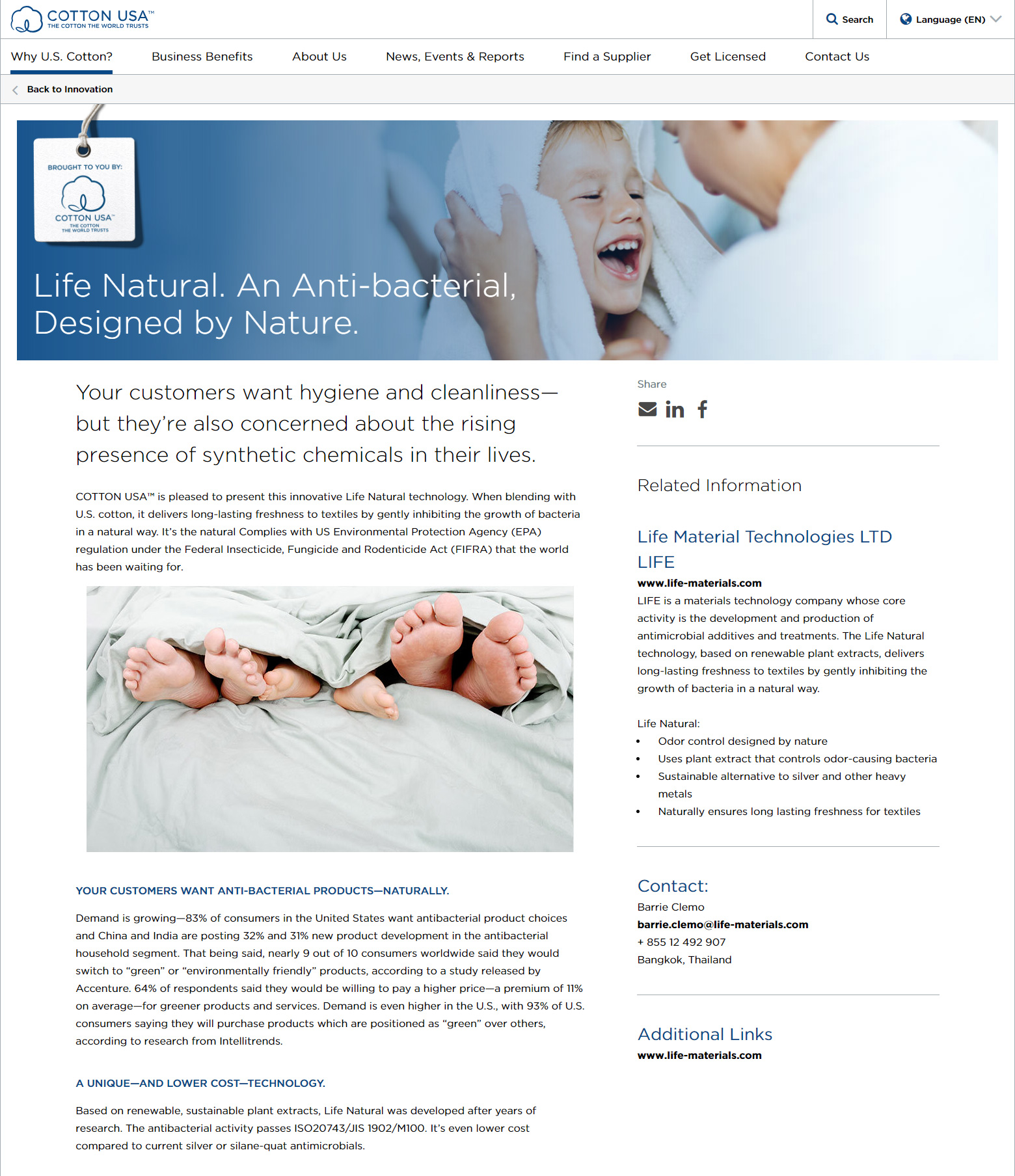
Telling the Story of U.S. Cotton to the World
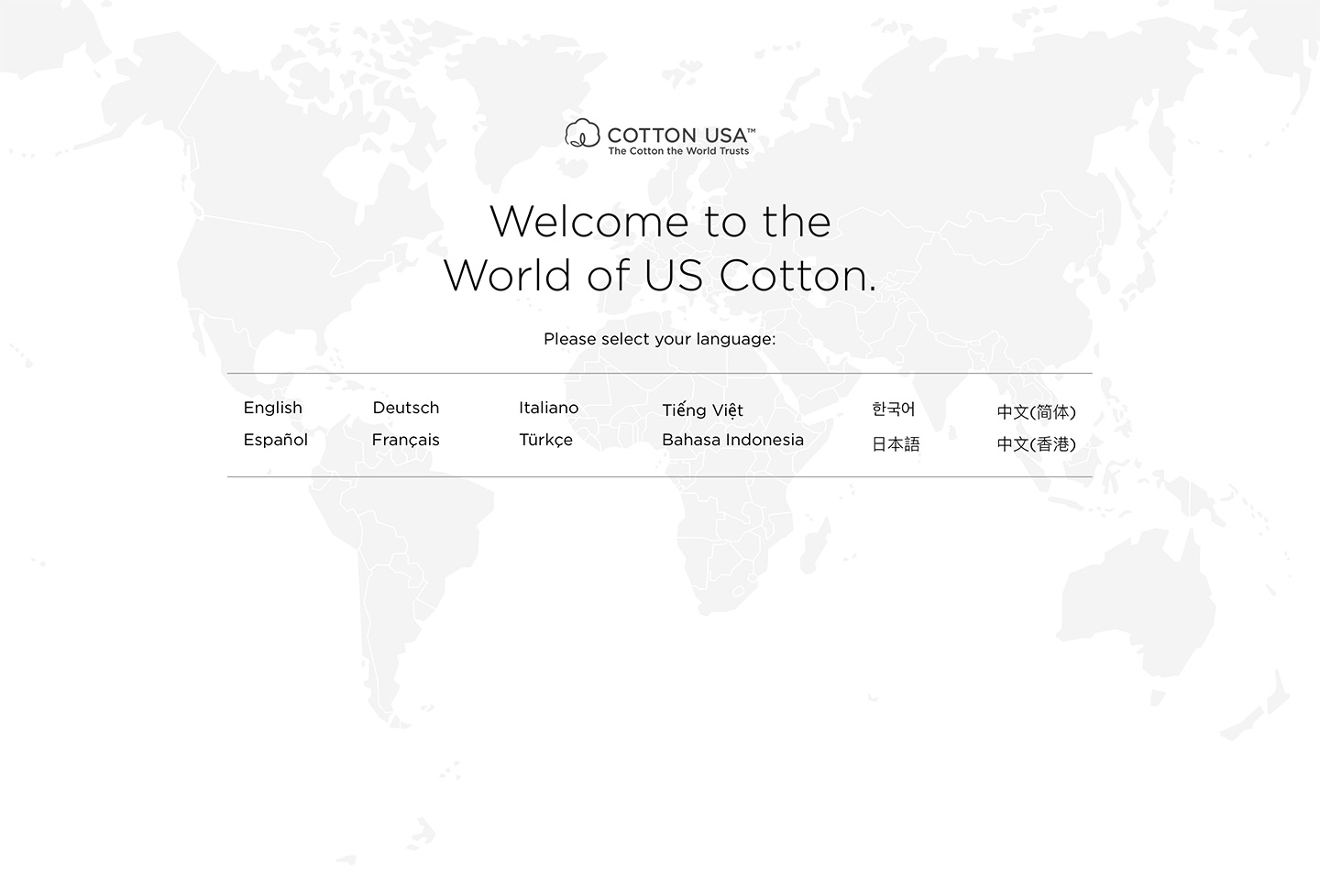
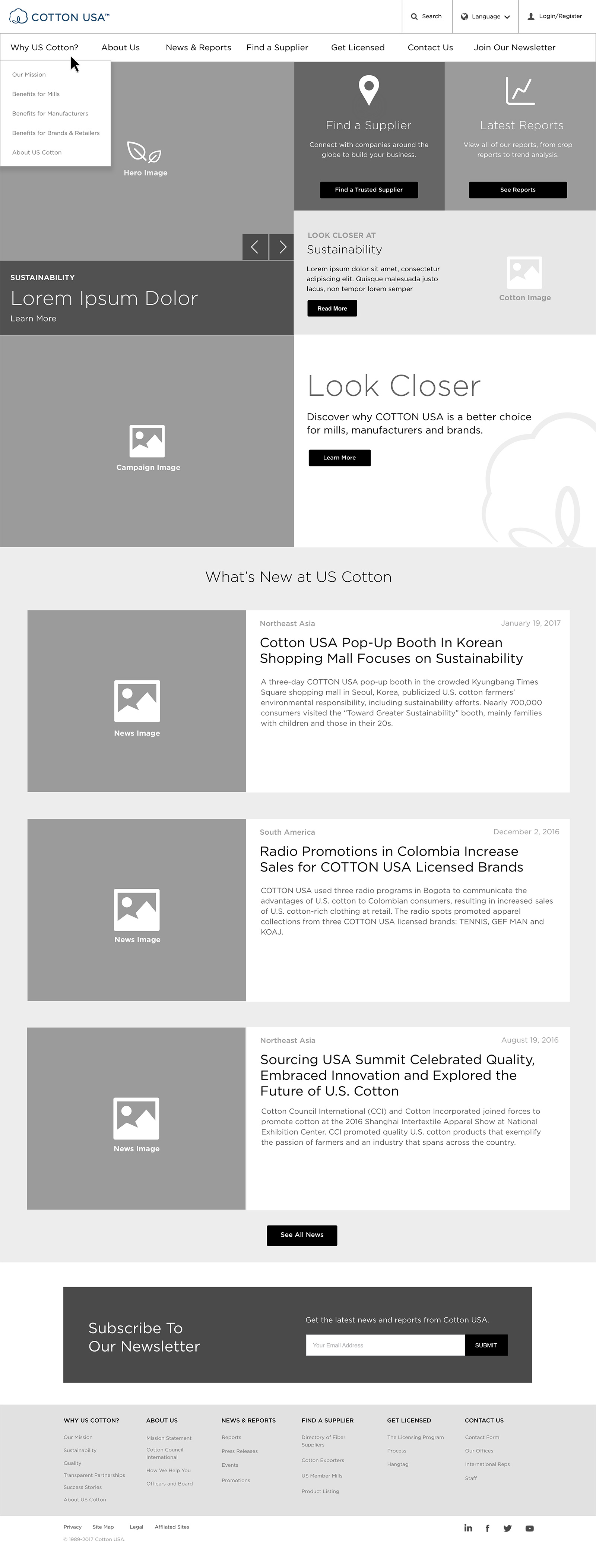
Cotton USA’s mission is to support the distribution of U.S. cotton around the globe, but the messaging on their website was unclear and its content fragmented multiple websites, one for each region.
To better aid the telling of a unified story, we consolidated Cotton USA’s different web properties into a single website and content hub, and we improved their wayfinding, so that their website would show the right content to the right people at the right time.
Target Users
Three Primary
Audiences
At the outset of the project, the client identified three key users to their website:
- Mills
- Manufacturers
- Brands & retailers
Each of these visitors had a different need when it came to content and messaging, so a key objective of the website was to make it easy for these users to find information relevant for them quickly through navigation and wayfinding.
User Needs
Mills
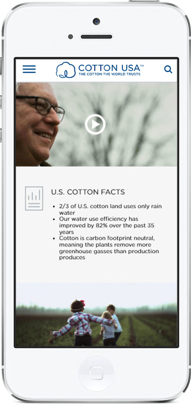
Want to know their cotton fiber is contamination-free and is durable, because they want to avoid breakages and ensure high yield.
Manufacturers
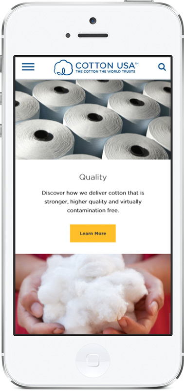
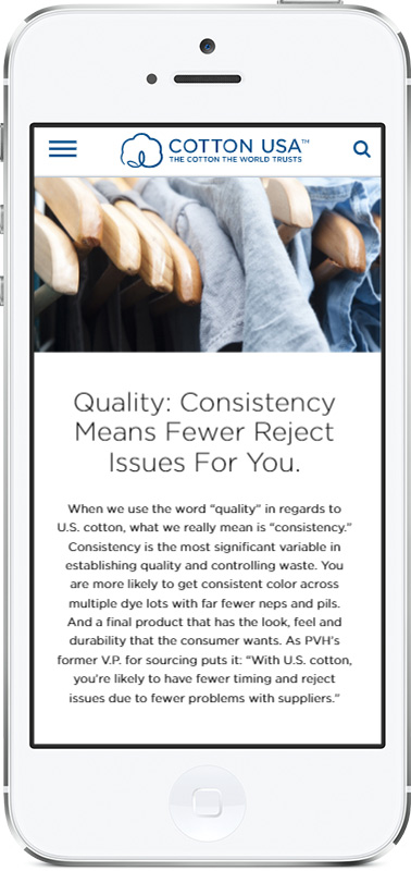
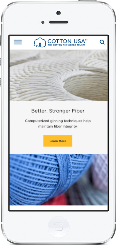
Care about the consistency, durability, and traceability of their materials, so they can produce high quality clothing for their clients who are typically brands.
Brands and Retailers
Want to ensure their clothing was made sustainably and that their customers can expect their clothing is made of high quality.
User Experience
UX Artifacts
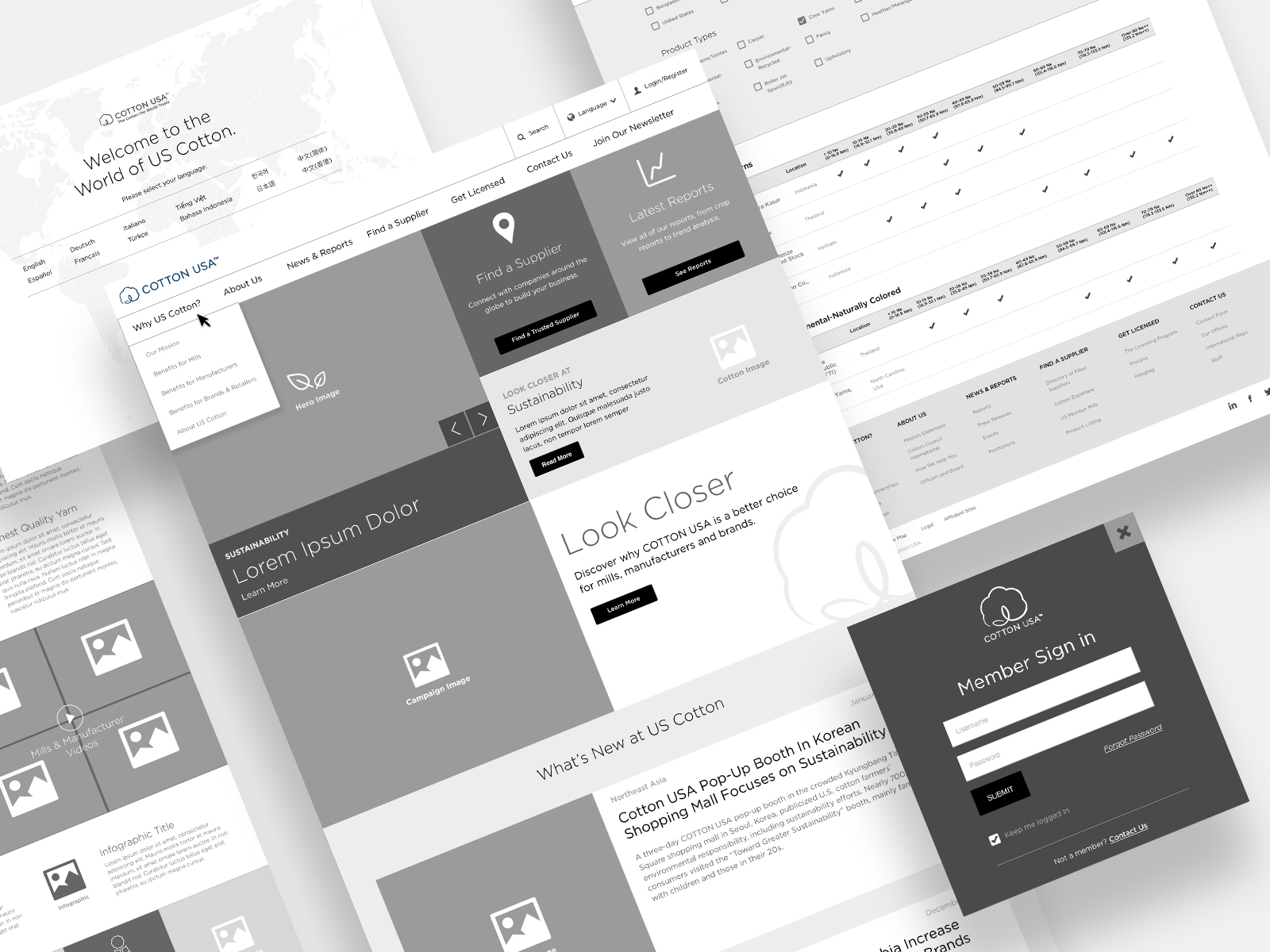
The process began with an audit and then led into strategy revolving around the information architecture and user flow of the experience.

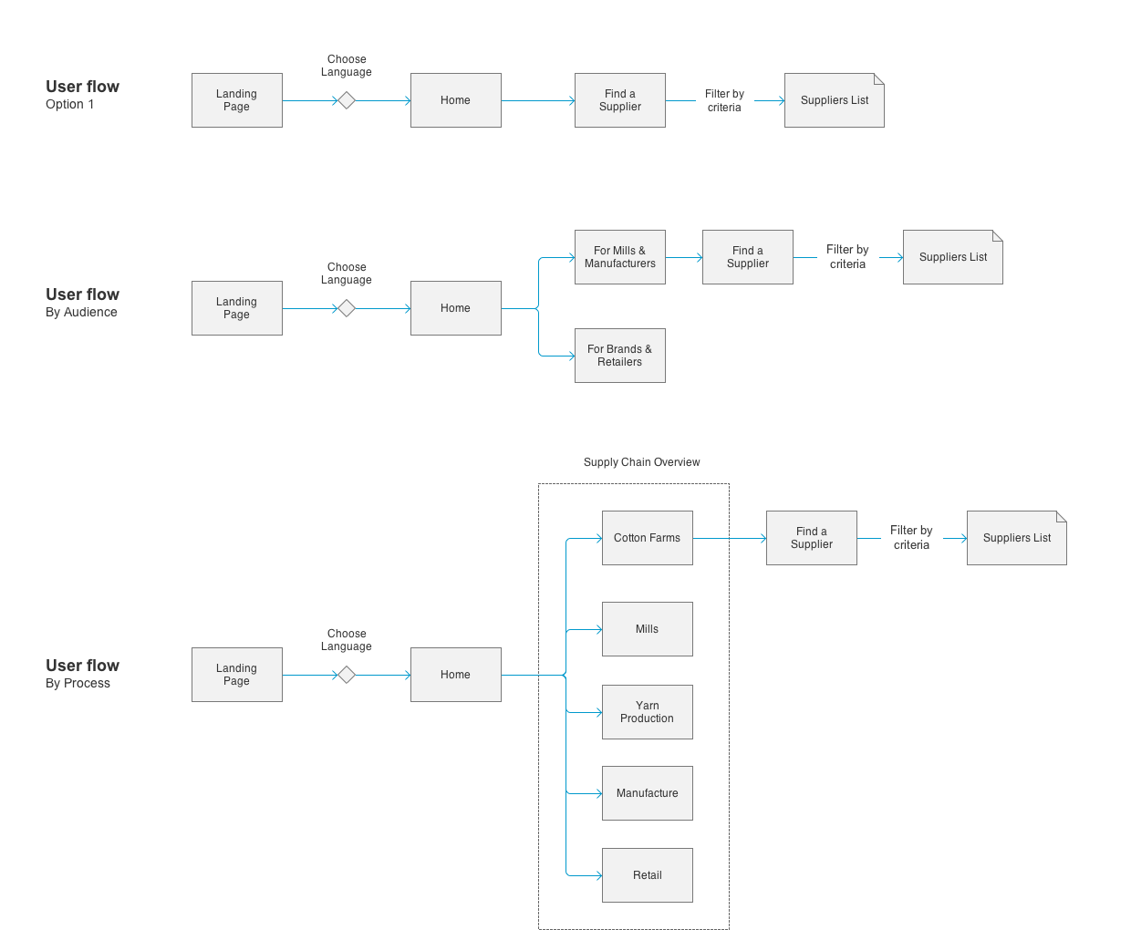
User-Centered Process
Testing, Learning, Refining
Because of the uniqueness of the audience, we strove to test with the target audience early and often. We did this through formative testing as well as evaluative usability testing.
Throughout the course of the project, we continued to refine the homepage design and introduced new landing pages as the needs of the site were identified.
User Feedback
“Interesting. Organized. Modern. I like the look of it. It has a nice modern look. It seems easy to figure out what features are on the website from this home page.”
“The place where it says mills, manufacturers, brands and retailers is small. Maybe those need to be underlined. Are you expecting somebody to click on are you a mill or manufacturer or retailer? My first impression as a user is I would not click that.”
“On the mobile, it is much clearer where I want to go. It resonates far more for me on mobile. I find it much easier to navigate on mobile.”
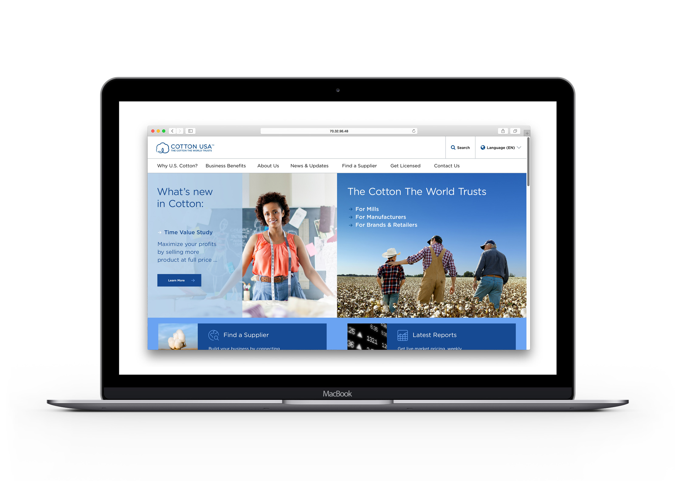
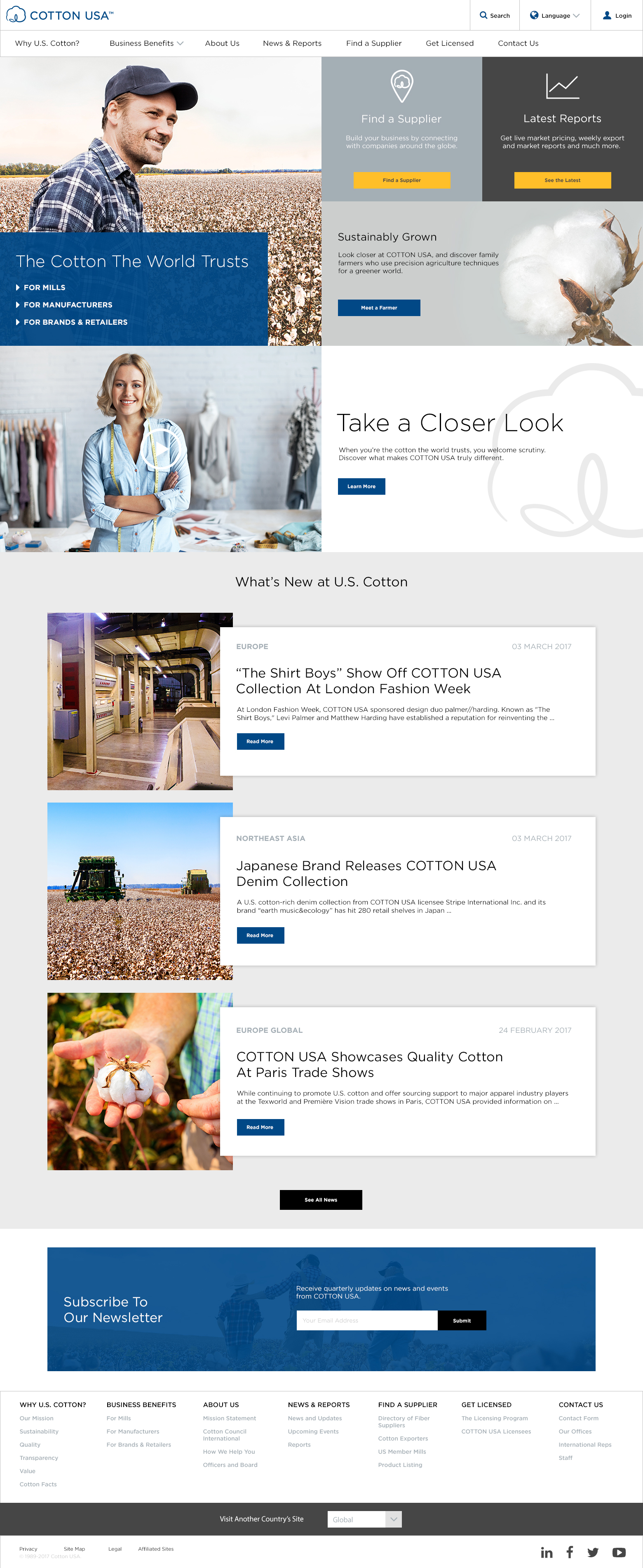
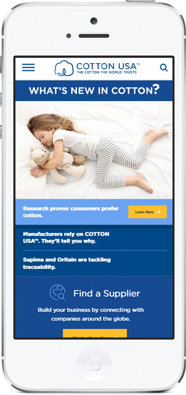
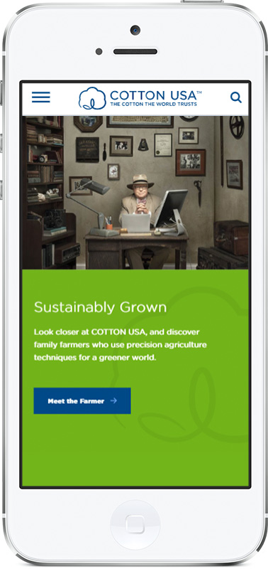
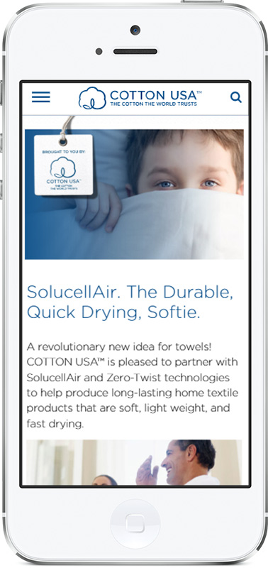
Desktop Design
Mobile Designs
Usability Testing Footage
One of our UX/UI optimizations centered around the design of the masthead on the homepage. We prototyped 3 different concepts and facilitated a remote moderated user test with participants around the world. Below is some of the highlights from that study.