Client
All Aboard Florida
Year
2017
Team
- Christina Calvit (CD)
- Dmytri Gouba (Design)
- Max Morein (UX)
- Juan Pena (Design)
- Won J. You (UX/UI)
My Role
- Experience Director
- Interaction Design
- User Research
- UX Strategy
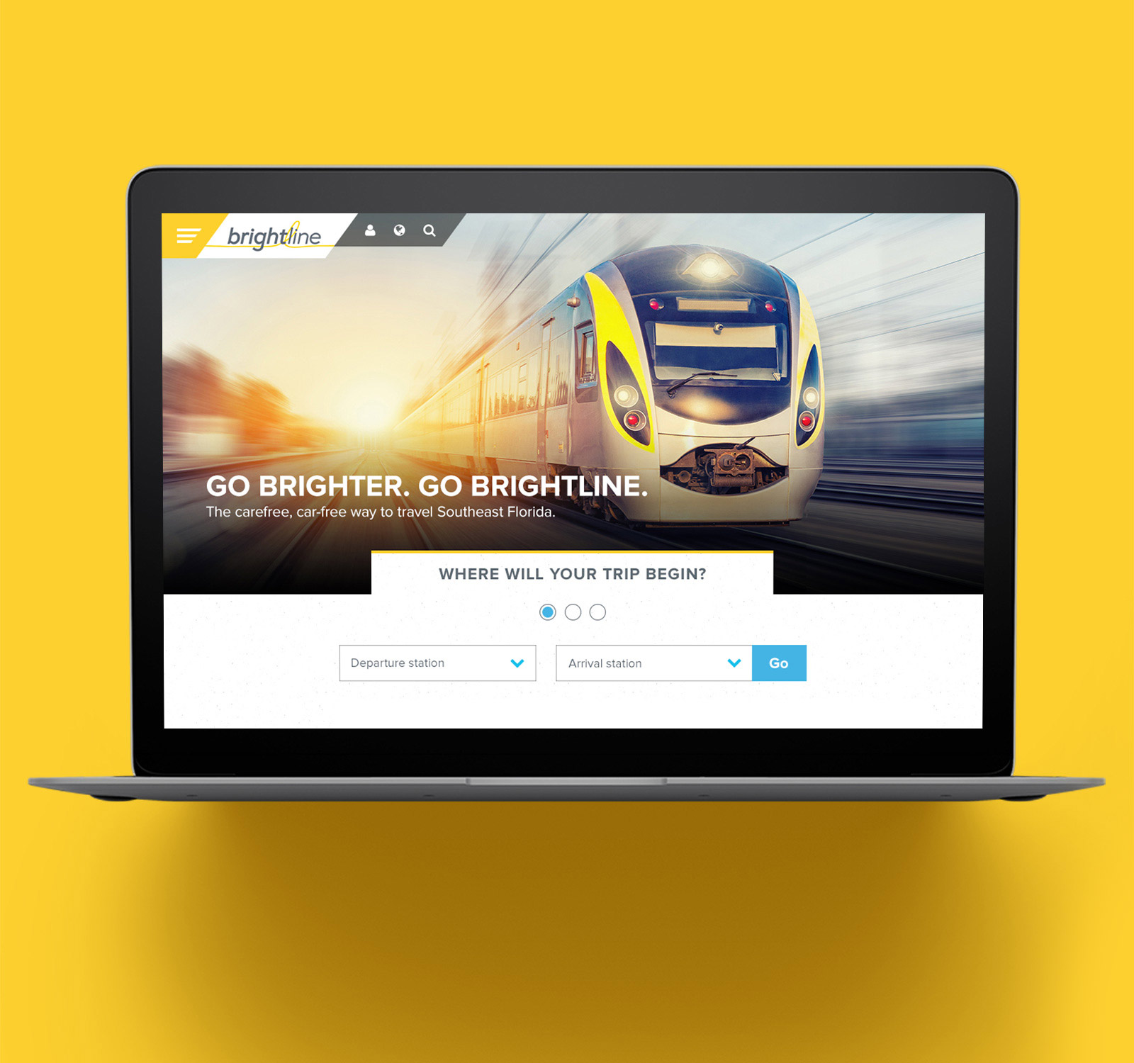
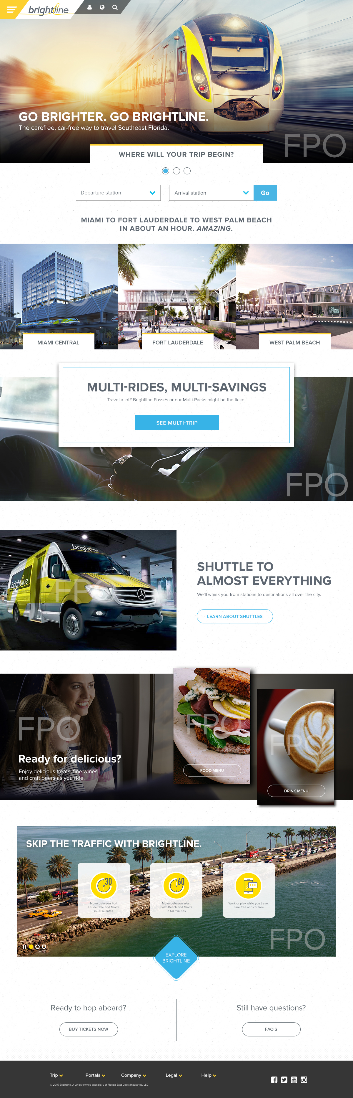
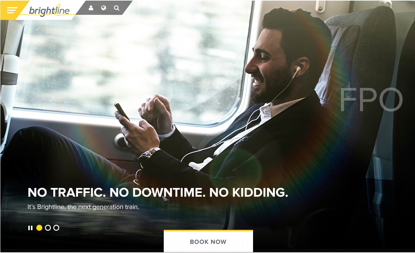
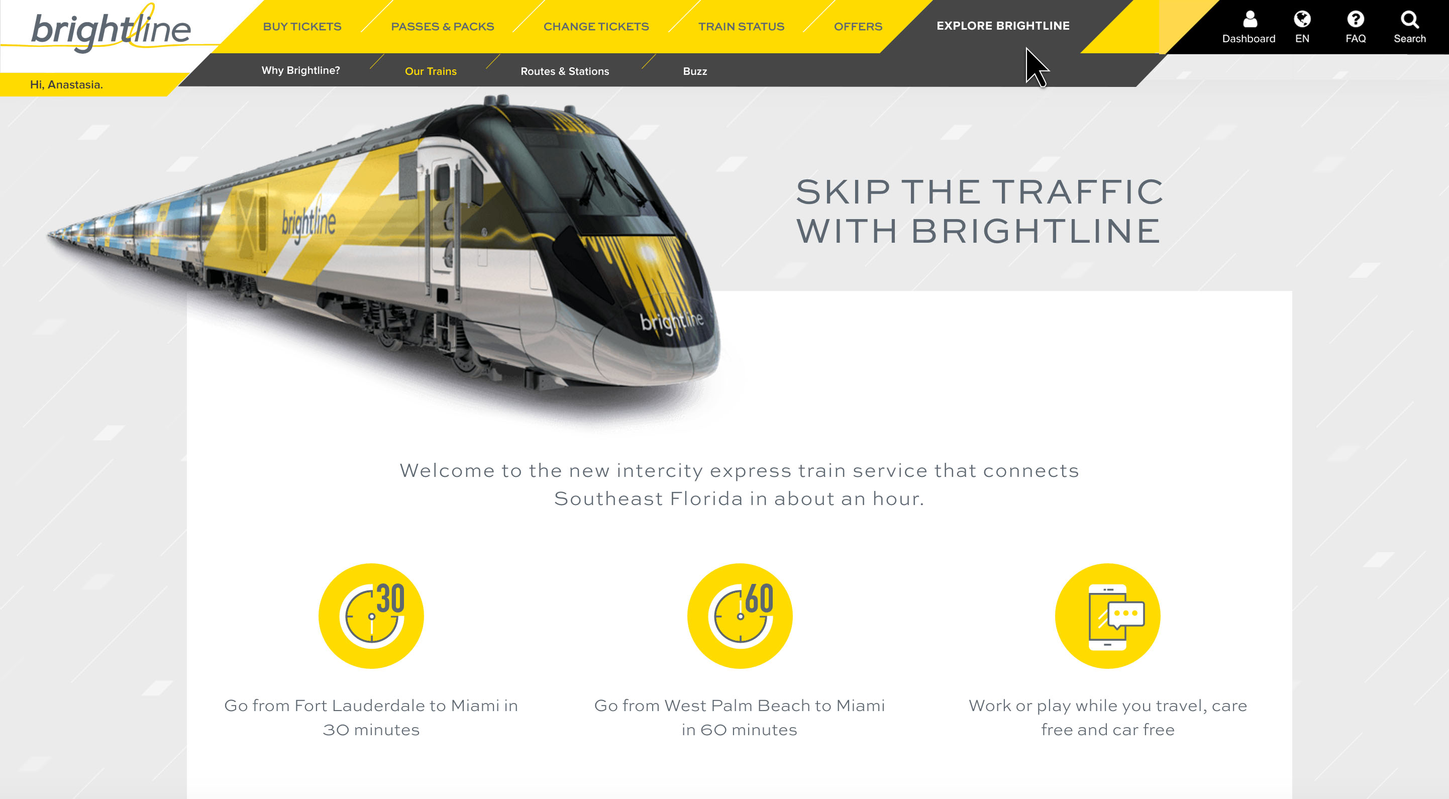
Launching Florida’s First High-Speed Rail
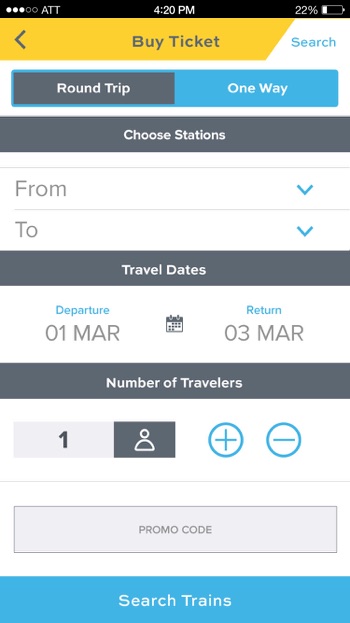
Brightline is a privately-operated express rail system that connects passengers to major cities in southern Florida. The project included creating the website eCommerce experience where passengers could purchase tickets, as well as developing the mobile app counterpart.
The primary challenge for the purchase flow was the fact that the booking process resembled an airplane ticketing flow and included some special accommodations atypical of American train lines.
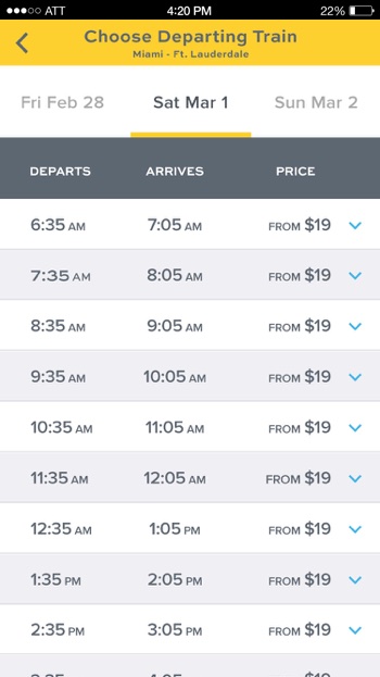
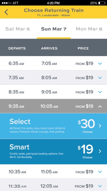
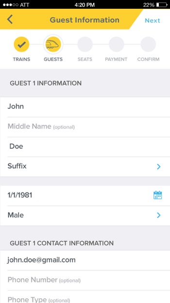
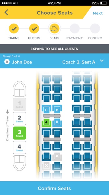
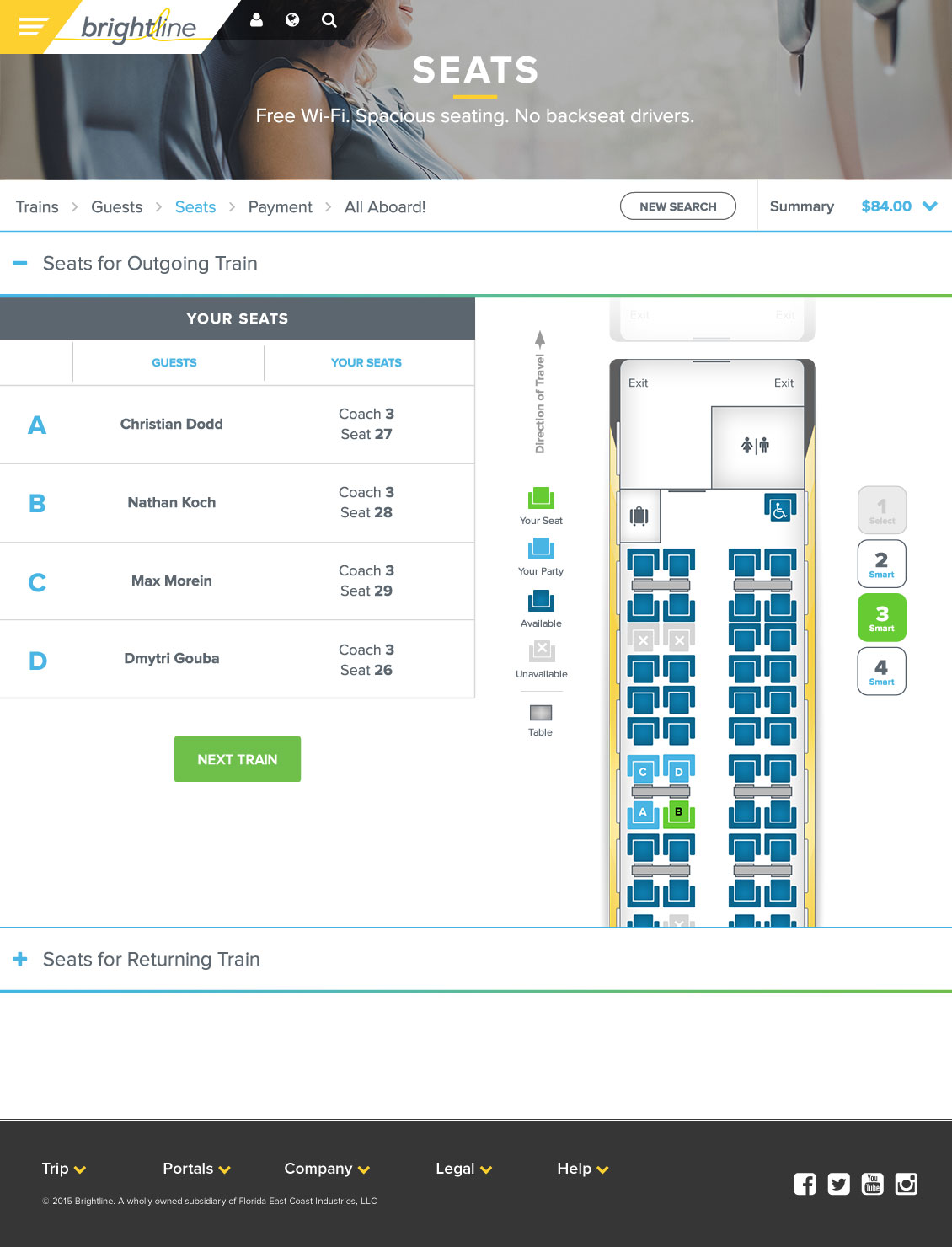
Booking Flow
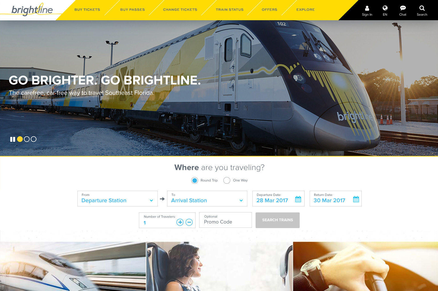
Initial Design
At the beginning of this project, the website had already gone through a number of design concepts, and was honing in on finalizing the purchase flow experience.
Usability Testing
As the experience design director, I oversaw the implementation of a usability study conducted by a third-party firm. The key objectives of the qualitative study was to understand:
- Overall perception
- Ease of navigation
- Usability of key tasks such as ticket purchase
- User travel preferences
Participants
15 participants ranging in age, ethnicities, and household income.
Methodology
In-person moderated usability study conducted in a laboratory facility.
Protocol
The testing sessions featured the think-aloud protocol with both concurrent and retrospective probing.
Equipment
All participants were asked to perform the tasks on a PC desktop.
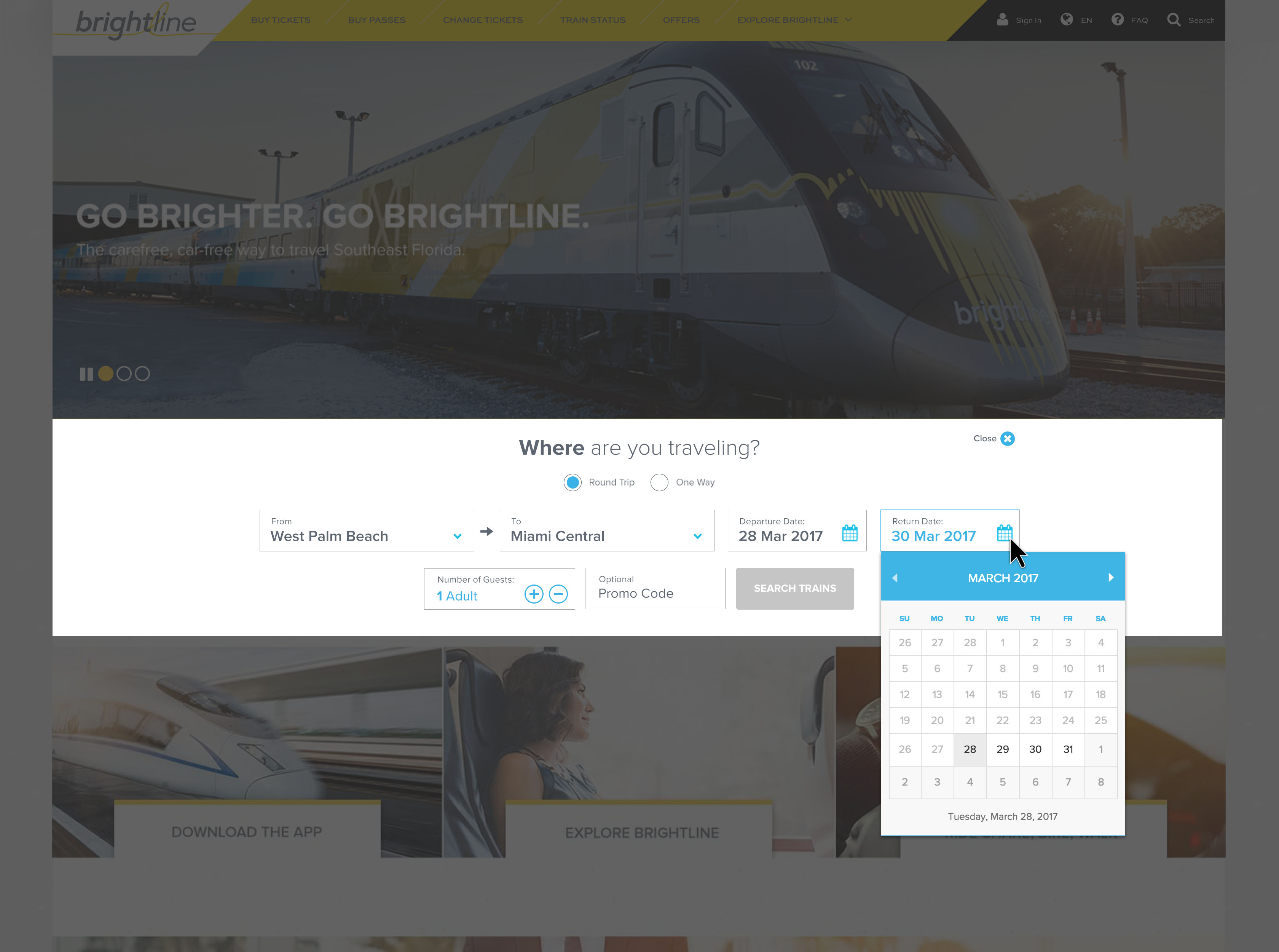
Usability Findings
A variety of UI changes were made based on testing. Below are a couple of examples of the opportunities that were identified.
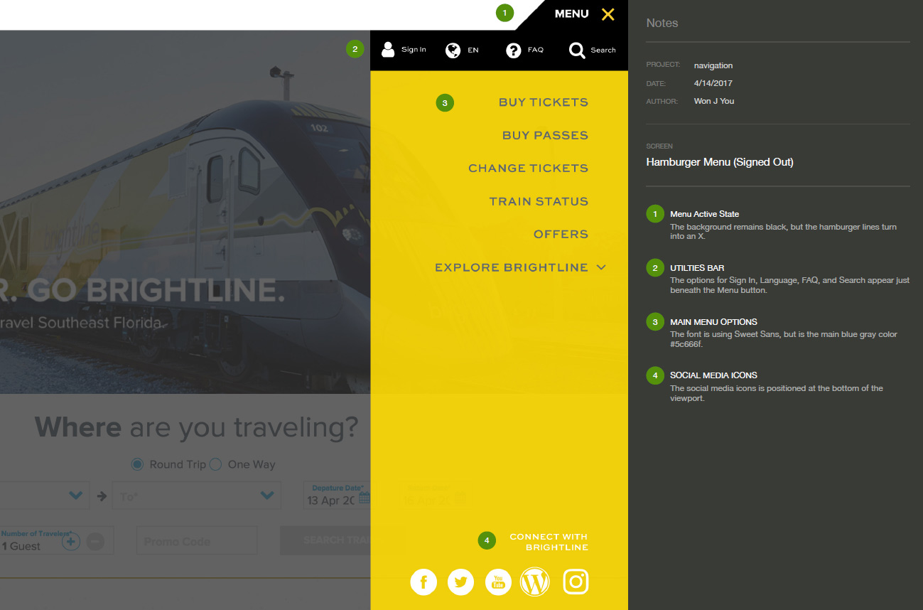
Unclear Navigation
A number of users had difficulty recognizing this hamburger menu as the primary navigation. This was solved by creating an exposed horizontal nav bar.
Carousel Autoplay
Users had difficulty with the speed and pacing of the carousel animating automatically.
Booking CTA
The booking widget needed to be above the fold to increase visibility and discoverability.
Unclear Icons
The icons didn’t clearly communicate their functionality. For example, the person icon was login. The globe icon was languages.
UI Design improvements
To address the findings from the usability study, we introduced a more familiar horizontal nav bar, and we added text labels for the utility icons.
The carousel was also shortened to allow more space for the booking widget to appear above the fold, and we further improved the booking process by exposing the key input fields for starting the booking process.
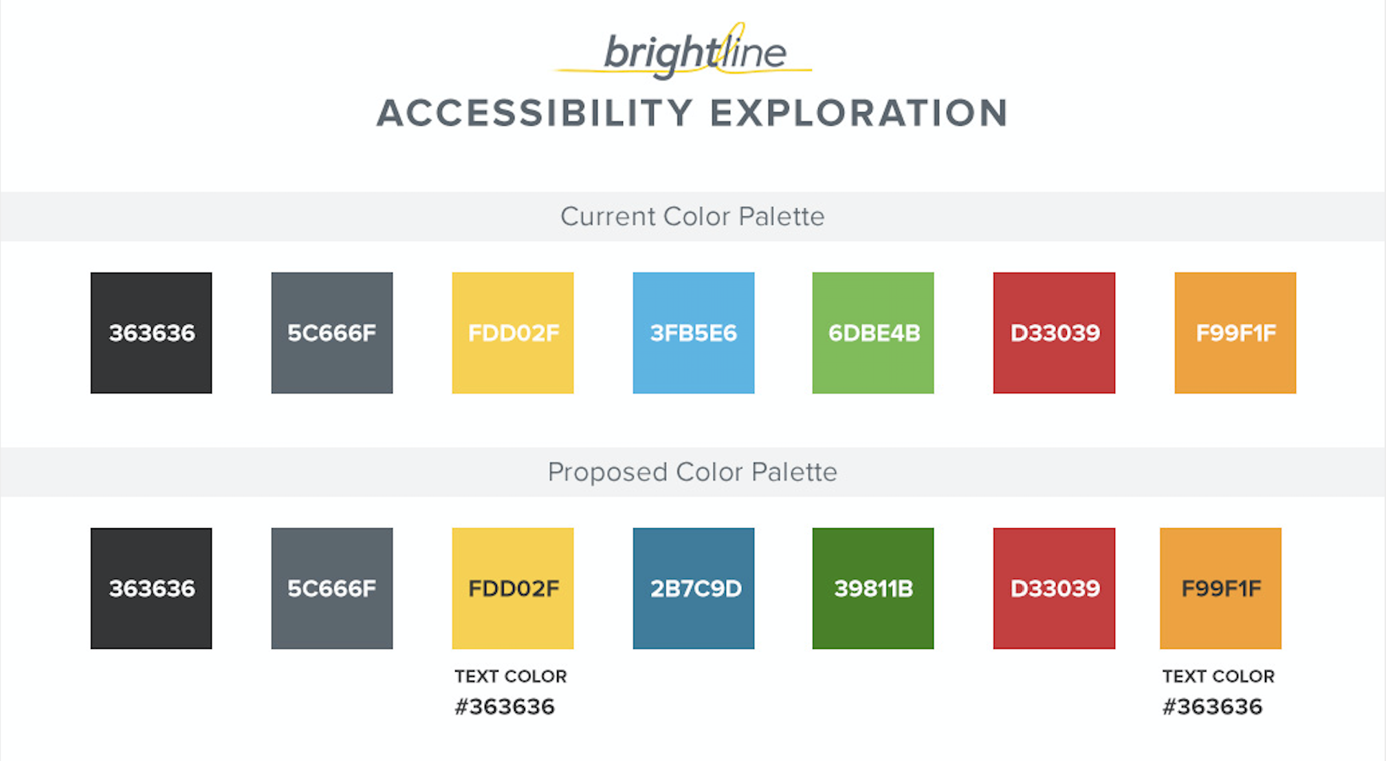
Accessibility Compliance
The original color palette didn’t meet WCAG 2.0 standards, so the palette was improved to feature higher contrast.
Design Details
Throughout the build of the website, I created a variety of prototypes to explore adding a level of delight into the experience.
Intuitive and Visually Unique
One of the slicker elements of the new navigation design was to carry the forward-leaning rectangle shape into the drop-down menus and secondary navigation.
Annotations
To ensure the design and all of its details were correctly implemented, detailed annotations were created as part of the deliverable to the engineering team.
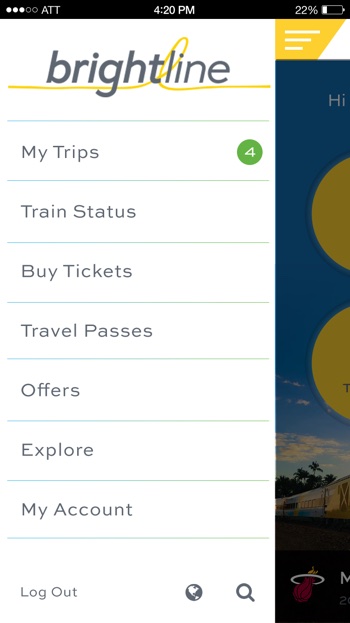
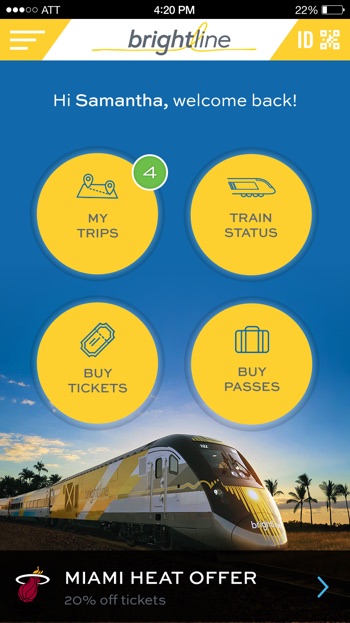
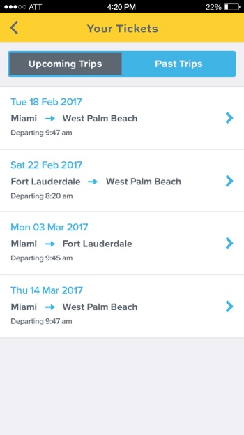
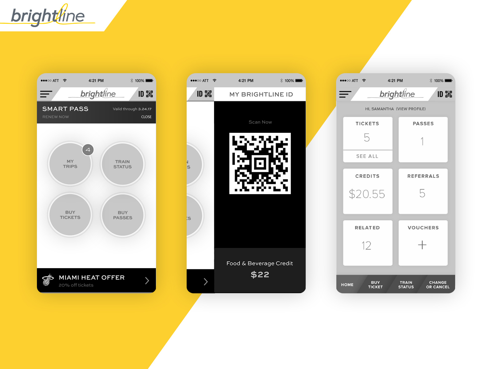
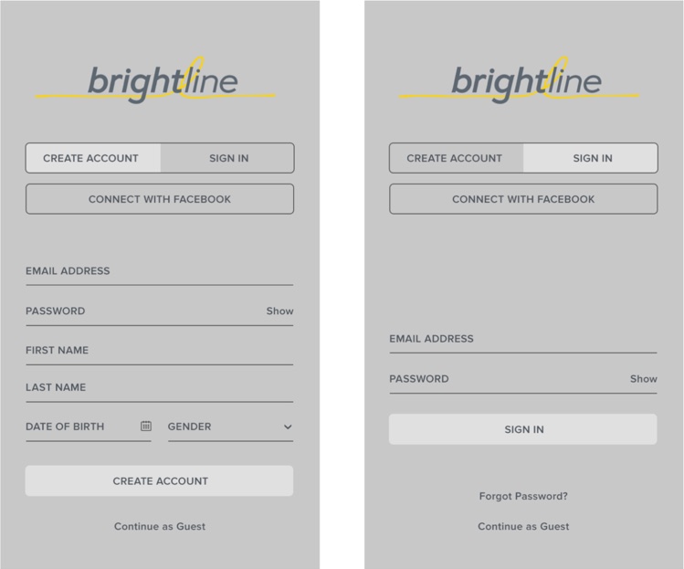
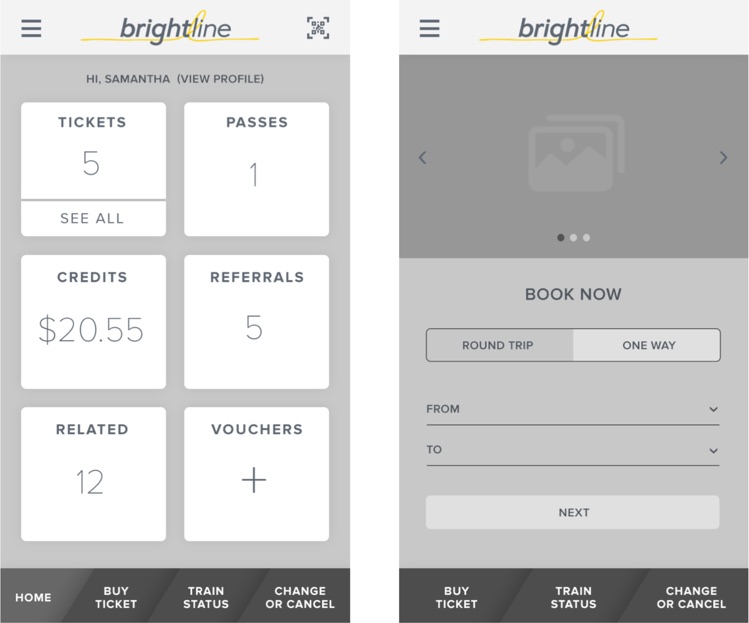
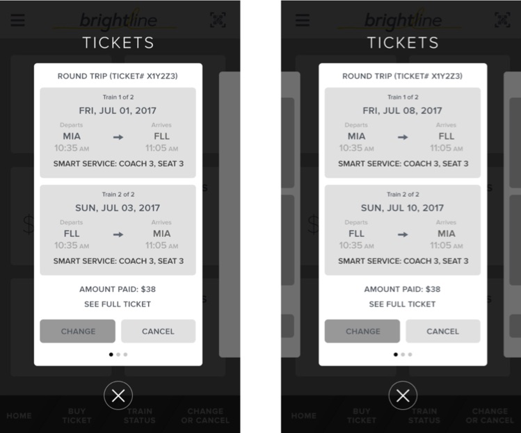
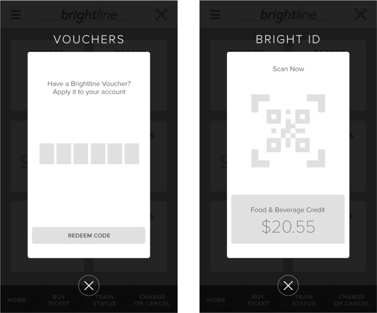
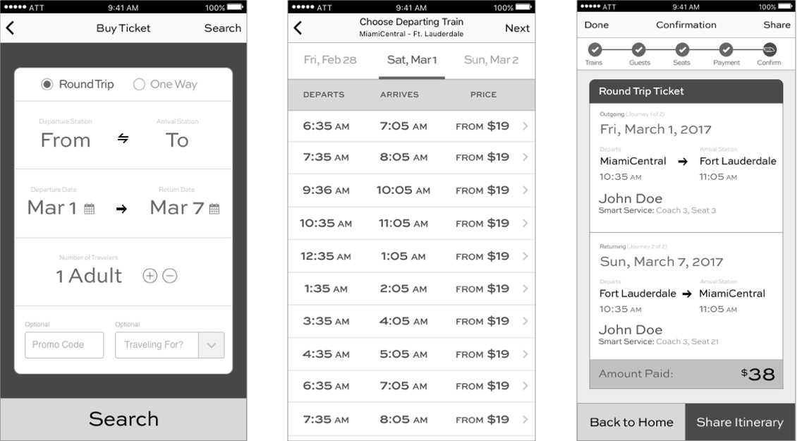
Mobile Design
Interaction Design
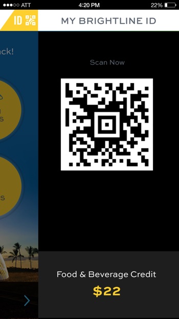
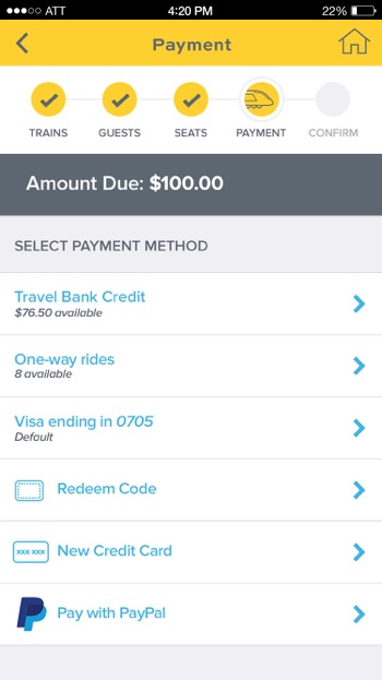
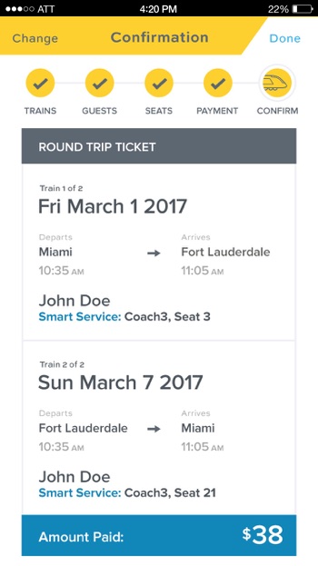
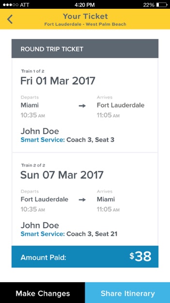
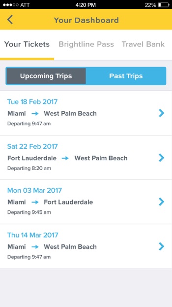
The mandate was that the app had to feature all of the same capabilities of the website, along with additional enhancements such as digital check-in for boarding and support in-station and onboard purchases and personalized promotions.
The key challenge was fitting all of this functionality into a smaller device size for both iOS and Android.
Early Design Concepts
Based on some early research and competitive analysis, the team pulled together some initial design concepts for the mobile design.
Around Round of Wireframes
Due to technical feasibility and the tight timeframe, some of these ideas had to be simplified for the product launch.
Visual Design
Mobile App Experience
The functionality of the mobile app had to be that it featured all of the same capability of the website, along with additional capabilities such as being able to use it a digital ticket for boarding and buying food and other items on the train itself.